Welcome to my website, which was built by Hector from Sweden. I hope he’s over 18 years old, or I may have been commandeering homework time from a schoolboy.
My first novel, The Wrong’un, was published by Unbound in 2018. My second, All Grown Up, is currently being published by XXXXXXXX (Since this post, they have withdrawn their offer to publish the novel.) I’ve sent a cover template to the designer, XXXXXX, and we’ll have our first meeting in early February. (We did have a meeting, and I was sent several possible covers, but this came to nothing as the publisher withdrew their offer before the cover was finalised.)
Despite the old adage, book covers are incredibly important, and I want to get it right. All Grown Up is about the early sexualisation of young girls and our collective collusion in this process, and I’d love the cover to reflect this, but how? I respond very powerfully to visual images, but I’m not especially good at conjuring them up.
I love the cover of the The Wrong’un, which was designed by Marc Ecob mecob.co.uk. Four years down the line, I still think it’s beautiful, and deftly imbues a superficially happy image with subtle menace.
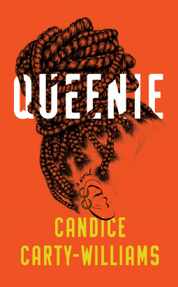
I’ve researched a number of covers recently, and here are some that I love:
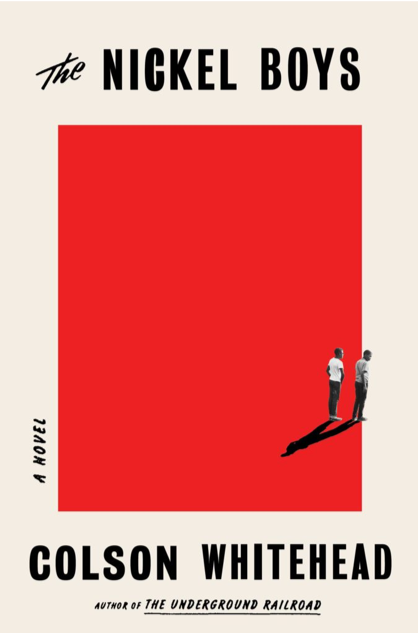
Such a striking use of colour, the two figures with a melded shadow, one enclosed and the other making a bid for freedom.
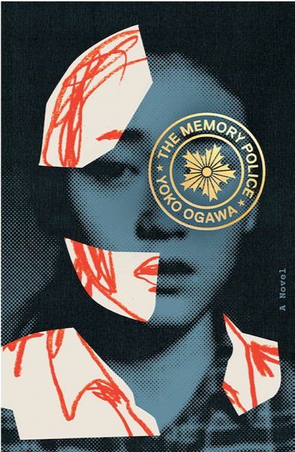
I would buy this book for the title alone, but I absolutely love the cover. The girl is vulnerable and afraid, yes, but he contrast between the pixellated blue and the red scribbles imply that she is being erased. The photo looks old… is she still young, is she still alive? What have they done to her? The official looking stamp which covers one eye gives her beautiful face the slant of a Terminator. As I haven’t read the book, I can’t tell you whether it lives up to its promise of intelligent intrigue.
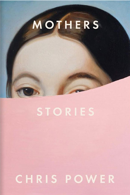
Any suggestions/ideas for top covers? I have loads more to put forward, but I also have dinner to cook.
Adios for now!
